Logos are everywhere. On the clothes we wear, on the phones we use, and on the food we buy—we’re surrounded. Some logos are incredibly straightforward—a letterform or a pictorial representation—and some are more complex. But one thing you can’t deny is that the meaning behind a logo informs the audience of what your brand is all about.
Many of us don’t even consider what these logos mean beyond the fact that they represent some of our favorite brands. But what we don’t realize is that many of them have a deeply rooted meaning hidden in or behind the famous symbol, and in this article we’ll uncover them.
Let’s take a look at 10 famous Logos with hidden meanings:
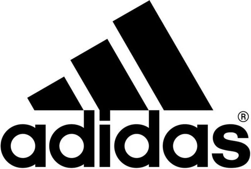
Adidas:
Adidas is a popular sports apparel and shoe company. Three stripes have always been a part of their logo, but in their most recent redesign, the stripes are staggered to look like a mountain. The mountain represents the challenges and obstacles athletes will face and overcome.
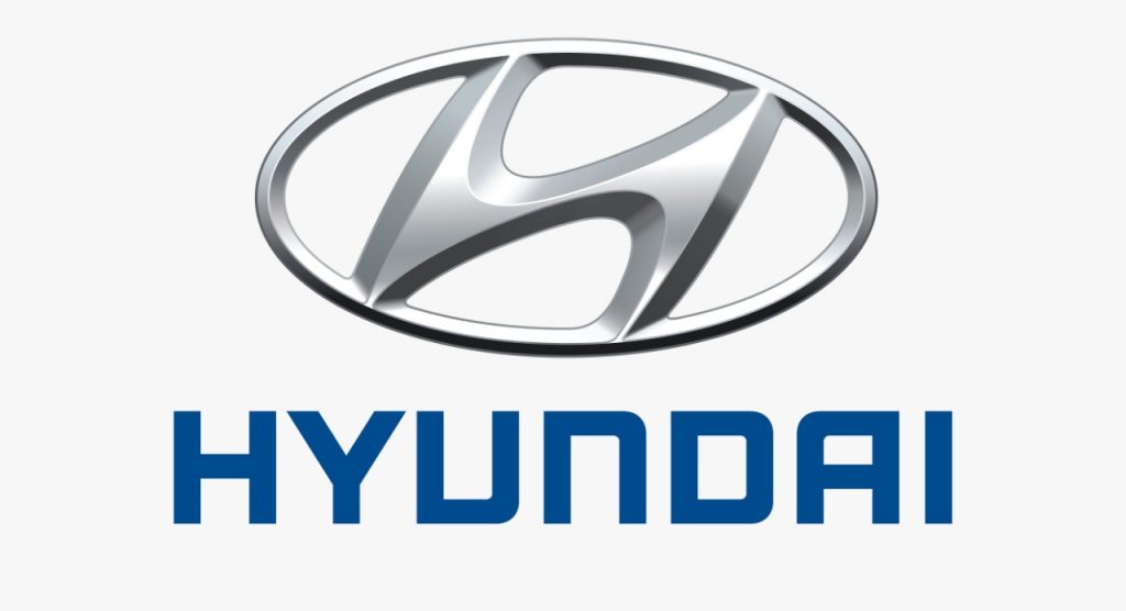
Hyundai:
Embedded within a widely-recognized symbol on cars around the road is a secret surprise. The “H” that everyone assumes stands for “Hyundai” also symbolizes two individuals meeting in the middle with a firm handshake – ostensibly representing the satisfying bond between brand and customer.
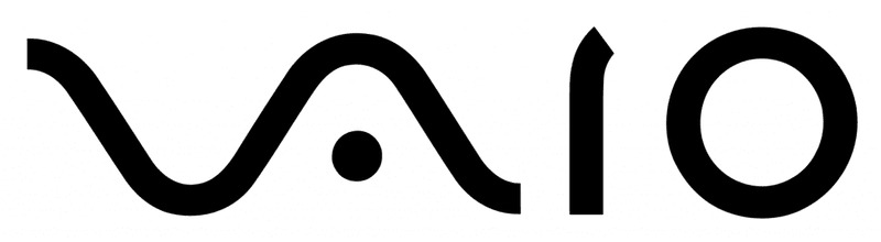
VAIO:
Sony Vaio, aka Visual Audio Intelligent Organizer, is known worldwide for its technology, but not everyone knows the meaning behind its logo. The ‘V’ and ‘A’ together represent an analog wave, while the ‘I’ and ‘O’ are reminiscent of digital signal (through the binary numbers 1 and 0).
Apple:
One of the most recognizable logos in the world, the Apple logo is theorized to have come from none other than the story of Adam and Eve. The apple is supposed to be the apple Eve bit from in the bible and represents the fruits from the Tree of Knowledge.
Baskin Robbins:
Baskin Robbins is known for its seemingly limitless flavors of ice cream (31, if we’re being exact). That famous number is hidden in the ‘B’ and the ‘R’ of their logo, acting as the curve of the ‘B’ and the stem of the ‘R’. The logo represents fun and energy, much like how you’ll feel during (and after) eating their ice cream.
Toyota:
Toyota’s current logo has been around since 1990. The popular car manufacturer’s three overlapping rings symbolize the unification of the hearts of Toyota customers and Toyota’s products. The background space represents their technological advancement and the opportunities that lay ahead.
Pinterest:
Pinterest got its namesake from the idea of ‘pinning’ things you like to a board. To further the idea of the pin, the ‘P’ represents a pushpin. This brings together the real life aspect of tacking something to your wall and also doing it in the digital age.
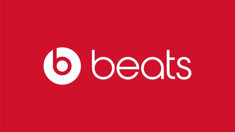
Beats:
The logo for Beats by Dre is pretty simple. The ‘b’ is enclosed in a circle followed by the brand name. The circle, though, isn’t just a circle. It actually represents a human’s head, and the ‘b’ letterform represents the brand’s headphones. This gives the brand a personal element, allowing a customer to see themselves in the headphones.
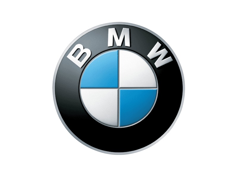
BMW:
BMW’s logo colors come from the Bavarian flag, which are blue and white. Their logo is derived from the Rapp Motor Works’ logo, which is very similar. It is commonly thought that the logo represents the blades of a spinning propellor, due to their aviation history and an ad created in the 1920s.
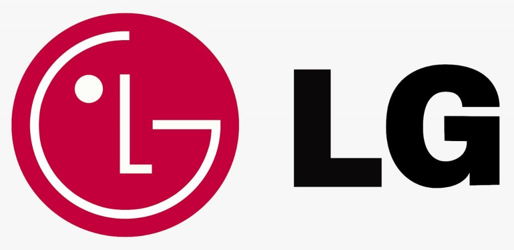
LG:
The phone company’s logo incorporates a strategically placed L and G, but what you may not realize is that it also makes up a face – ultimately humanizing the brand. See that little dot in the left-hand corner of the logo? That would be the face’s eye!